Course Project
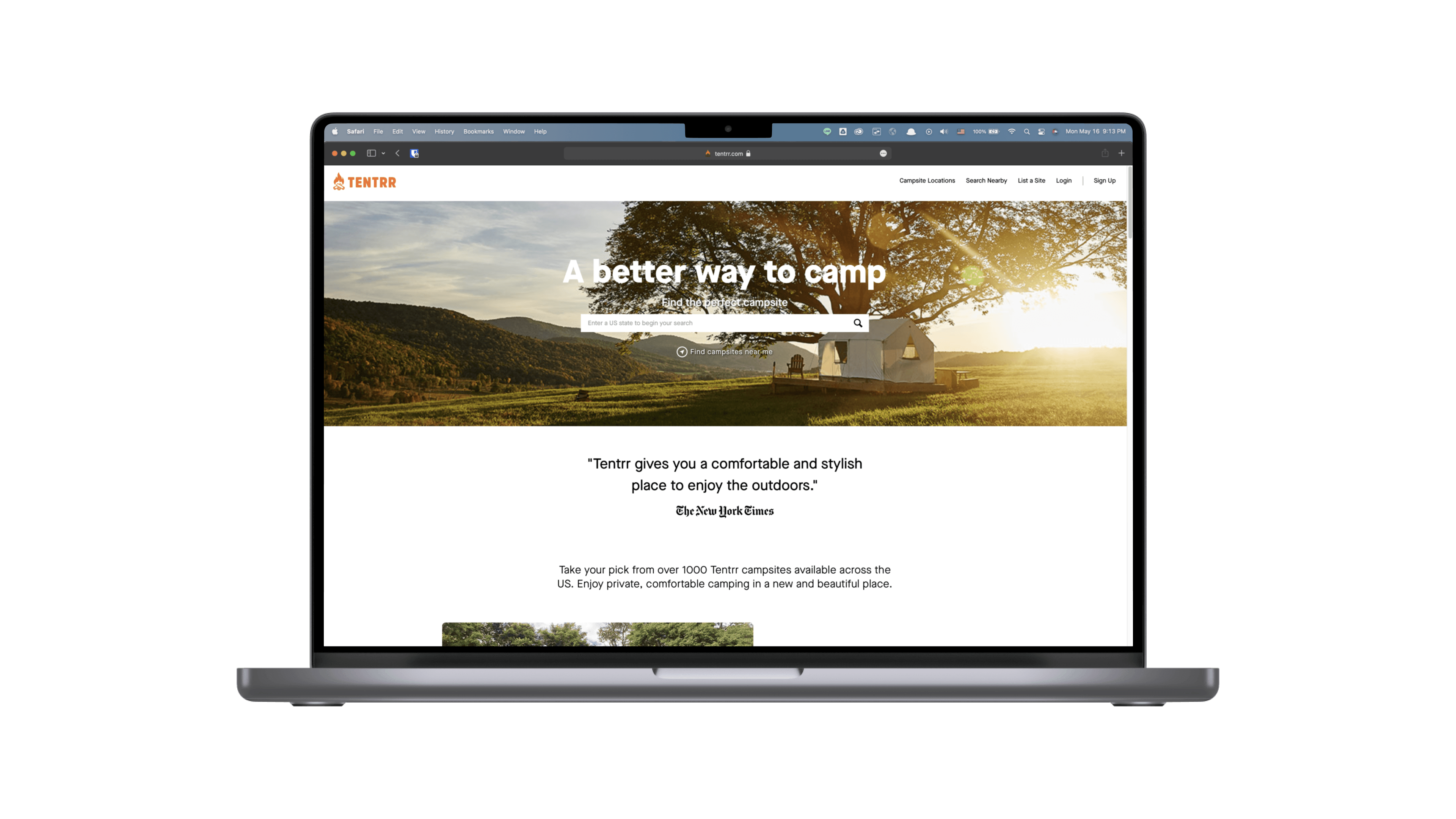
Tentrr.com - An Online Booking Website Designed for Campers
Conducting usability research on the online campsite booking website to discover usability issues and propose possible solutions.
Role
UX Researcher
Year
2022
Team
Alfred Lin, Jing Wang, Sourabh Doraji
Product Platform
Website
Project At A Glance
Reviewing the usability issues on the camp booking website that interrupt users from seeking the intended information.
In this project, we tried to find out the existing usability issues for users when they are trying to search for information or make a reservation on Tentrr.com for their upcoming camping trip. We used both heuristic evaluation and usability testing and combined the findings to provide constructive recommendations.
process
First, we performed the heuristic evaluation to do the initial research, then we conducted moderated usability tests with tasks from 4 scenarios to identify usability issues and provide recommendations.
finding & recommendation
We successfully identified 3 major usability issues and brought up the recommended solutions for each issue.
# Background & Process Overview
## Background
Tentrr is a campsite booking website, just like the business model of Airbnb but put focuses on outdoor accommodations such as campsite rental. Currently, the Tentrr's service areas are mainly within the U.S. and the number of the campsite is increasing as the pandemic goes on.
## Process Overview
Heuristic Evaluation
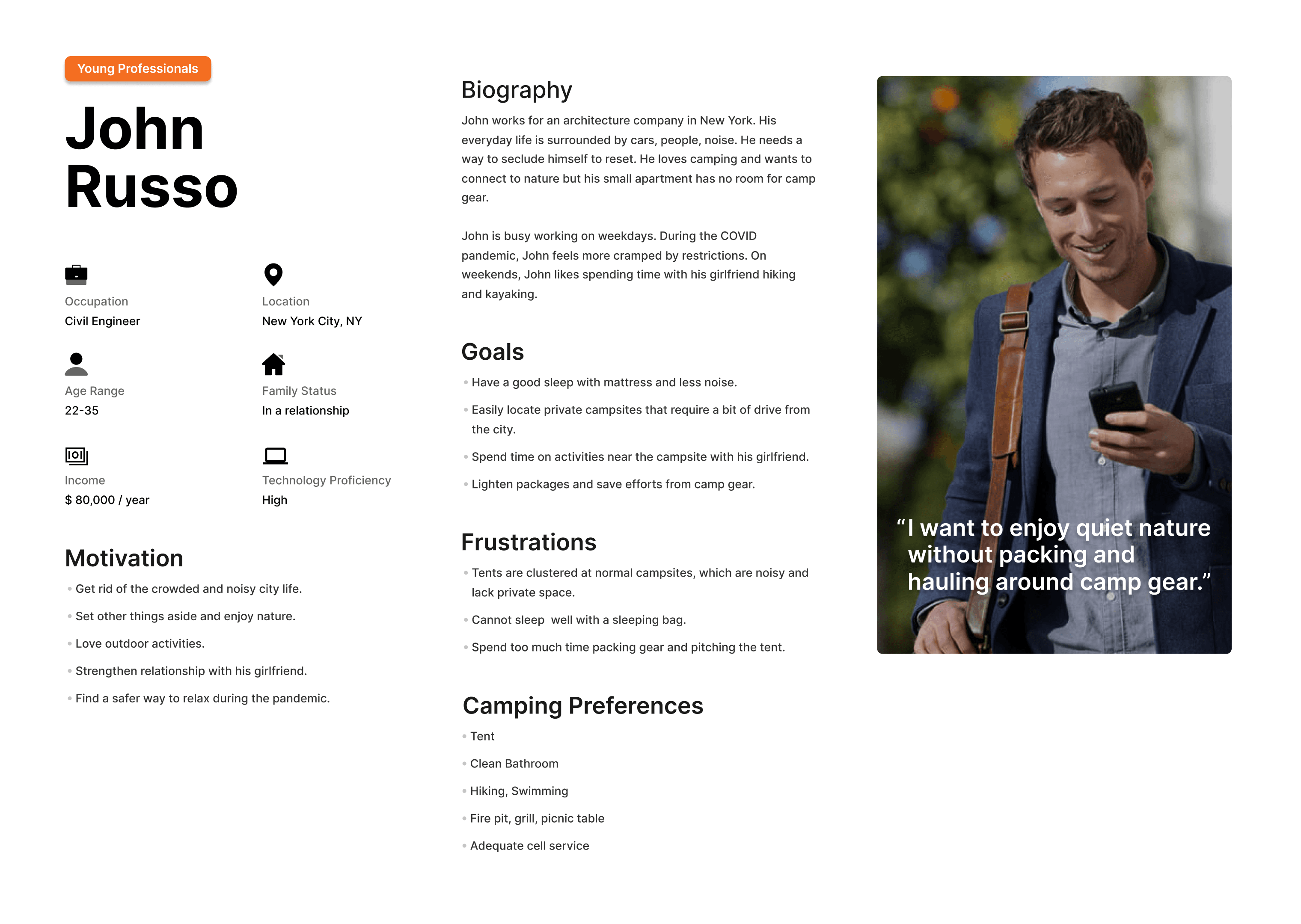
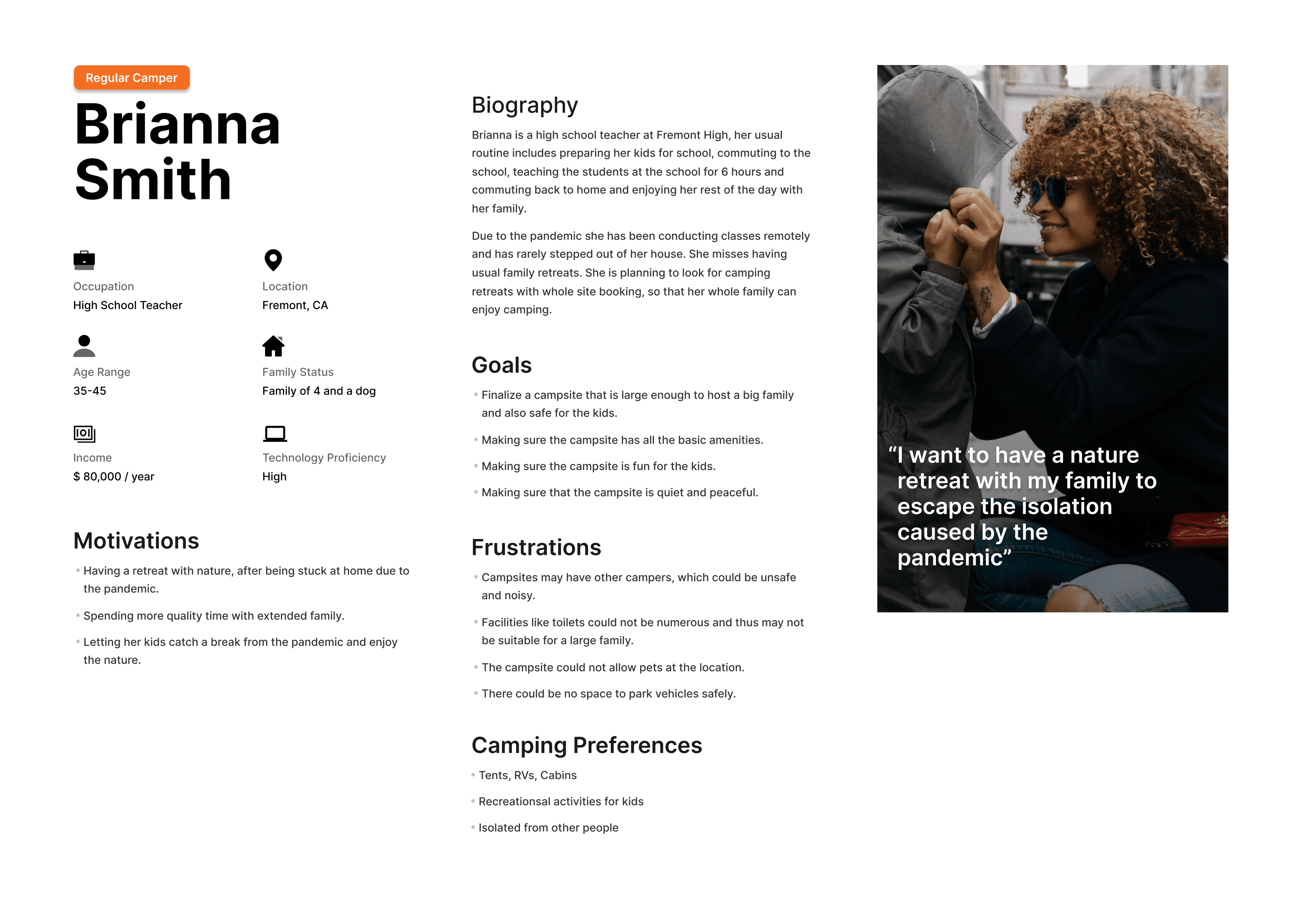
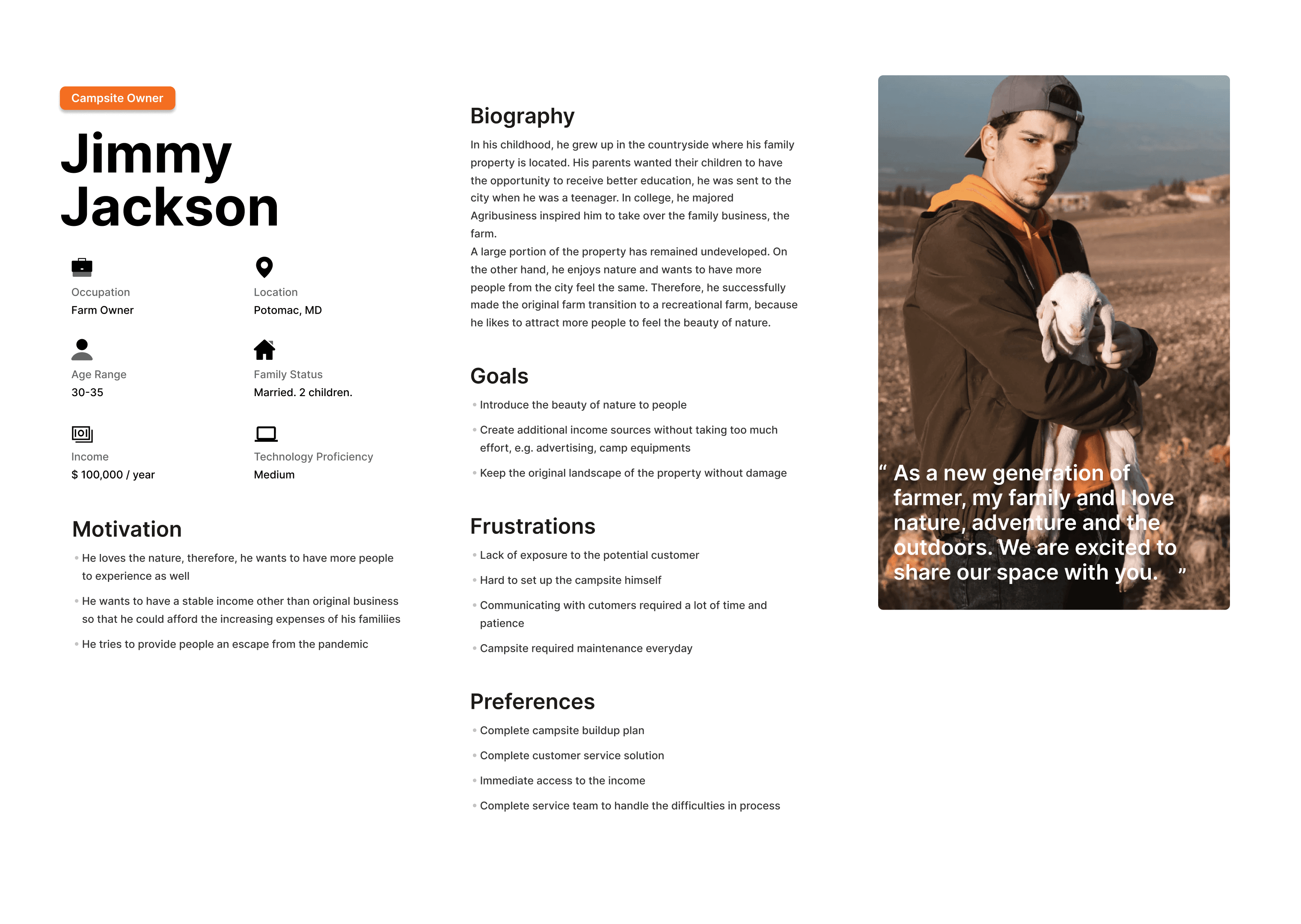
We created the three personas based on both the features on the Tentrr and the understanding of the demographic information for the campers in North America.
User Persona
We created the three personas based on both the features on the Tentrr and the understanding of the demographic information for the campers in North America.

Usability Testing
We first designed the tasks in 4 scenarios and conducted the usability tests with 3 participants in the hybrid format to identify the usability issues and verify the findings from the heuristic evaluation.
In this project, we started with conducting the heuristic evaluation for the website based on Jacob Nielsen's 10 general principles for interaction design, to identify the usability issues.
Based on the findings we discovered in the heuristic evaluation, we started with creating user personas based on the existing information to understand the target users of Tentrr. We conducted moderated usability tests with tasks from 4 scenarios corresponding to user personas. Using both heuristics review and usability testing, we successfully identified several usability issues and brought up the recommended solutions.
# Heuristics Evaluation
We used Jakob Nielsen's 10 general principles for interaction design to perform the heuristic evaluation of the website.
Below are the key findings we discovered, full report would be found here.
## Search Function

Rule violated
"Recognition rather than recall"
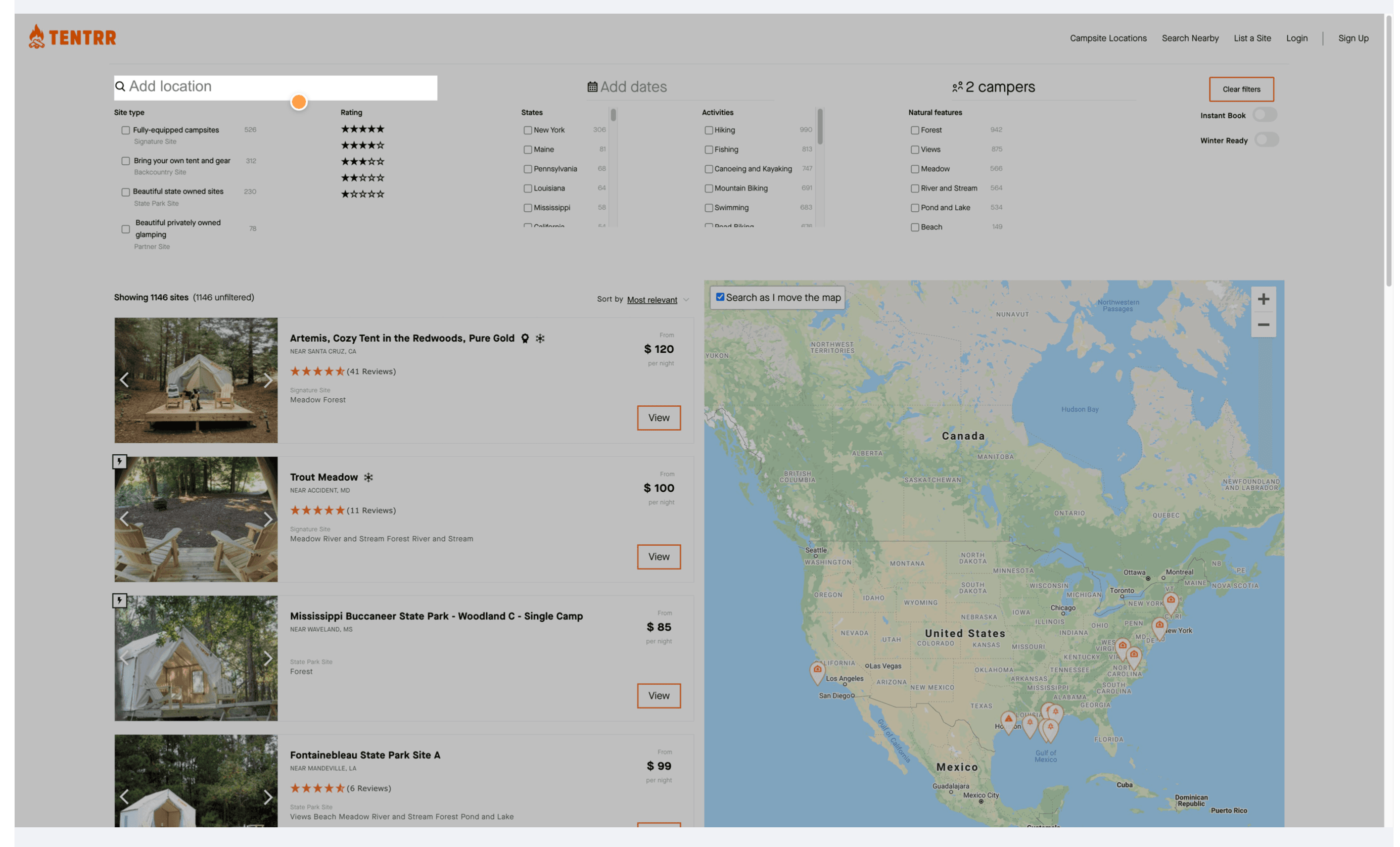
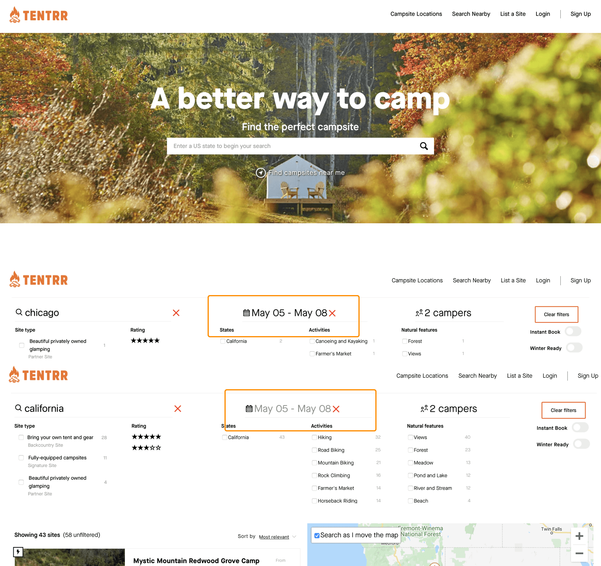
The location filter shows not only the location results but also results related to the word users put here.
Recommendation
Use the dropdown option for users to choose the location instead of searching campsites based on the word input by users.
## Filter Function
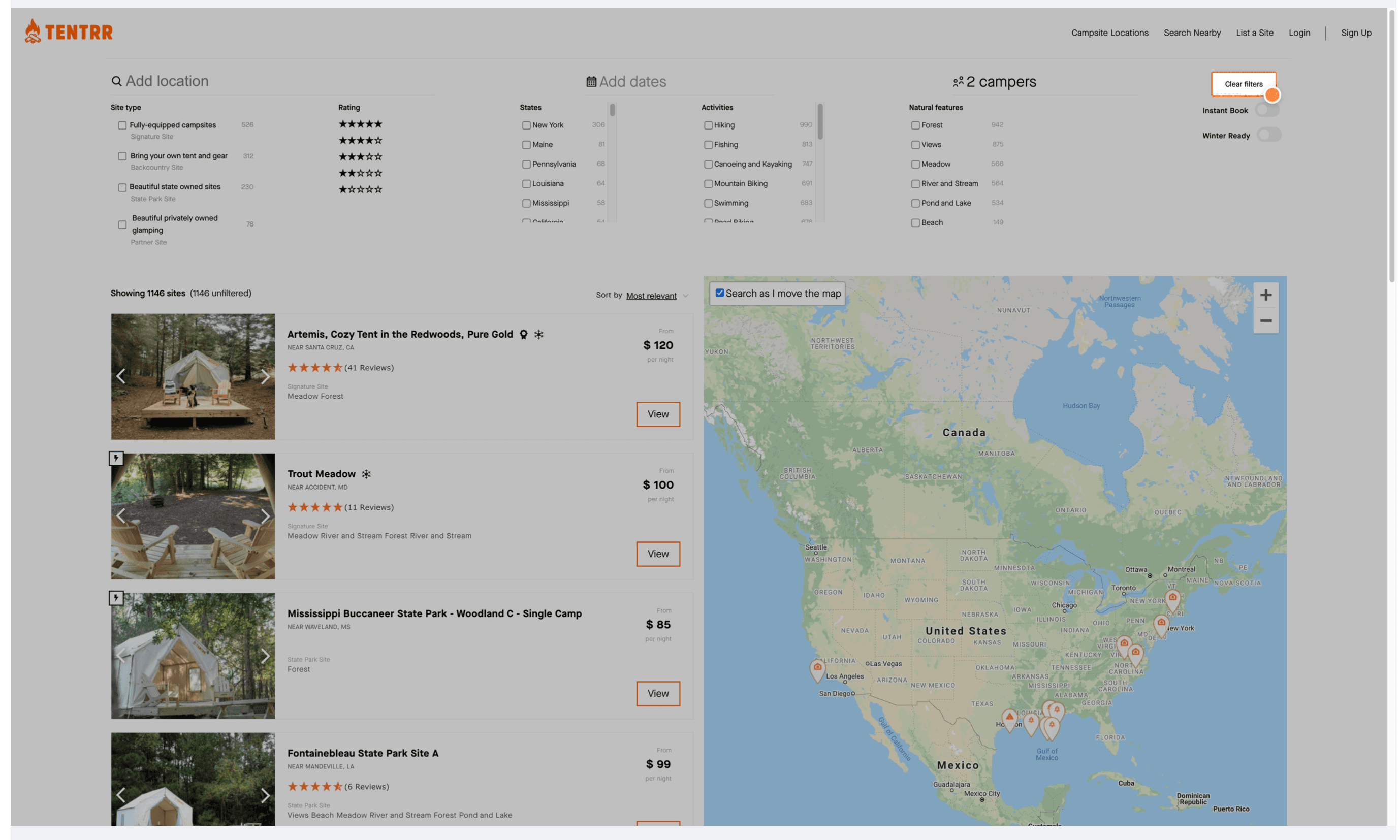
Rule violated
"Consistency and standards"
The "Clear filters" function is not only clear the options below but also the dates, which normally is not considered as the filter in this situation.
Recommendation
Make clear filter function only clear the below options.
# Personas
We started the whole usability testing by creating personas for the website users.
Since the website users include both campsite renters and owners, and referring to demographic information from Annual North American Camping Report, we divided users into three categories, a new camper, an experienced camper, and a campsite owner.
## A New Camper
## An Experienced Camper
## A Campsite Owner
# Usability Testing
Based on the findings from the heuristic evaluation and personas, we conducted the usability testing to identify the details of each usability issue for Tentrr.com.
## Timeline

Week 1
- Create personas.
- Prepare the test script for the usability test.
- Recruit the participants.
- Prepare moderation guides and dry runs to correct any discrepancies in the test flow.
Week 2
- Conduct the usability tests..
- Compile the data we gathered on a shared workspace.
Week 3
- Collate, analyze and summarize the user data to derive insights and recommendations.
## Test Setting
Role
There are 3 roles in usability testing, the moderator, the main observer, and the secondary observer. While doing the usability testing, we took turns to be a different role.
Hybrid Format
We conducted 3 usability tests, one was fully in-person, and another two were hybrid in which one of our observers joined the test via Zoom while the participants and moderators are in-person.
## Usability Test Structure
The usability test consists of three parts,
- 1. Ice Breaking Questions.
- 2. Three Scenarios and Tasks.
- 3. Closing Questions.
We also included the SUS(System Usability Scale) evaluation form at the end of the usability testing to collect quantitative data from participants regarding their perception of the website.
Each test section is roughly around 30 mins with one participant, one moderator, one main observer, and one secondary observer.
## Scenarios & Tasks
We designed 4 scenarios to guide the participant to go through the usability test. The scenarios are based on user personas to provide the context for the participants.
The tasks focused on the issues we discovered from the heuristic evaluations. Some of the tasks are designed to gain a deeper understanding of the usability issues.
After each task, we also ask the participant the confidence level when doing the task to identify whether the website provides the correct user feedback when users trying to accomplish the tasks.
Scenario 1
You want to camp with your partner next weekend, on a budget.
Task
1. Find a campsite in California with the lowest price during next weekend without bringing any gear.
2. Your partner suggested that they prefer somewhere in Virginia. Find out the campsite that is closest to the sea.
Follow-up questions
- (If the map is not used) Why didn’t you use the map feature?
- How do you feel when performing the task? (If the map is used and is frustrating) What made your experience with the maps frustrating?
Scenario 2
You just booked a campsite which requires approval from the campsite owner. You decided to add more details about you on website.
Task
1. Update information to show you are an experienced camper and really love camping. - (Ask follow-up questions based on the situation.)
Scenario 3
Your friend recommended the Indian Cove Pure Gold camp to you. You want to explore this campsite before reservation.
Task
1. Find the Indian Cove Pure Gold camp.
2. Could you get an extra tent at this campsite?
Follow-up questions
- Do you know why they ask you to input your birthday information?
- What did you feel when you visited this page?
- What is your confidence level for this task?
3. For future ID check, update your birthday information.
Scenario 4
You are a farm owner and want to make more money. You realize that you can rent your farm site for campers on Tentrr.
Task
1. Find out the average night rate when you list your site as a Tentrr Signature site.
Follow-up questions
- Are you convinced to list your farm on Tentrr after visiting this page?
- What is your confidence level for this task?
2. Apply for listing your farm as a campsite on Tentrr. (stop them after they finding the application page)
The completed test plan please refer to here.
## Participant Recruitment
We recruited 3 participants from our network. Two of the participants are occasional campers, and one of the participants is an experienced camper.

# Finding & Recommendation
After conducting the usability tests, we performed quantitative and qualitative analyses to synthesize the research findings.
By combining the research result from both heuristic evaluation and usability testing, our findings and recommendations are below.
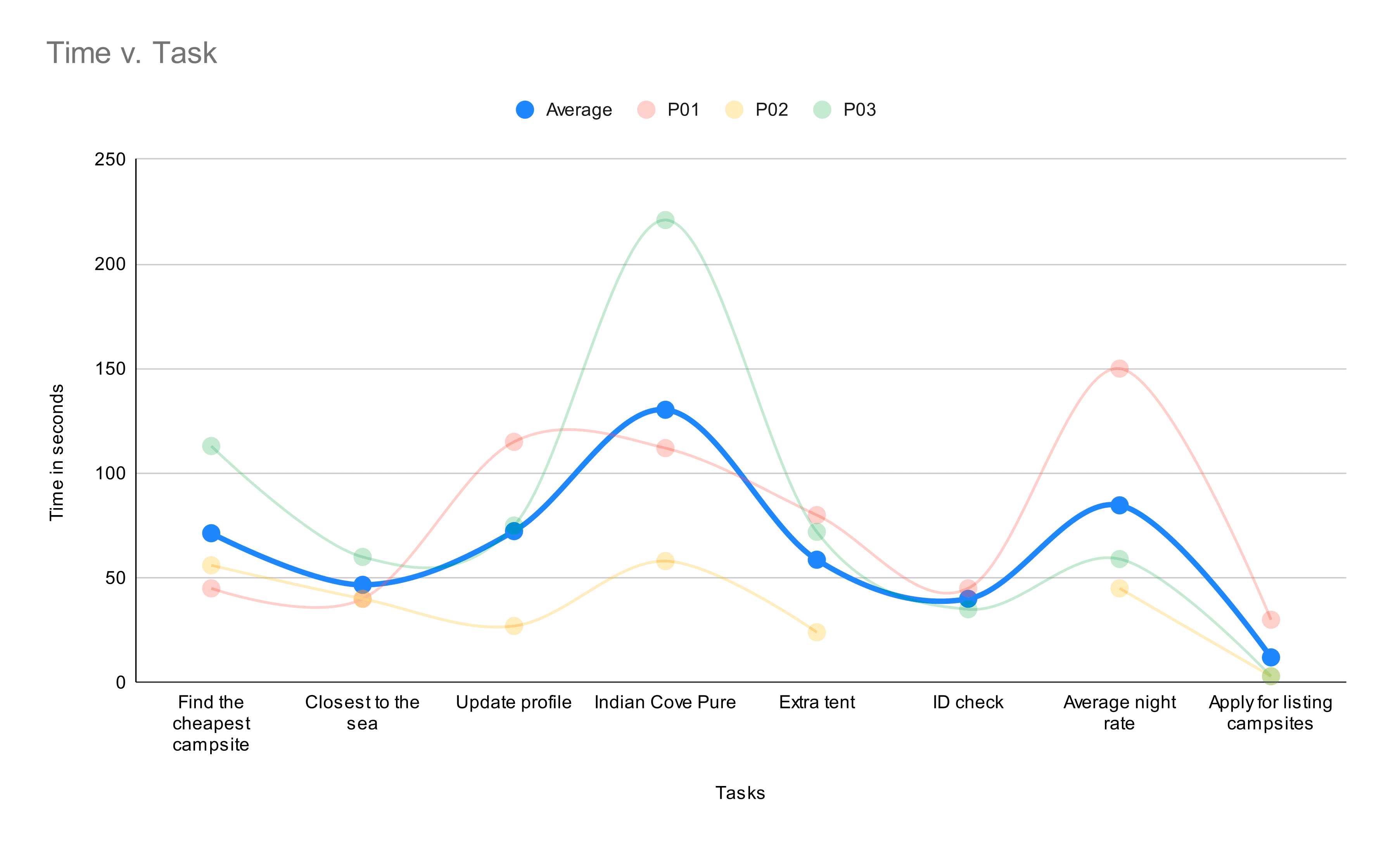
## Quantitative Analysis
## Lack of Visibility of System Status
We observed that users found it hard to complete the “Indian Cove Pure Gold” Campsite. This was due to the filters being retained from the previous task without the user's knowledge.
## Insufficient Instructions
We also observed that the task which involved panning/zooming around the map to find campsites was not successfully completed by the participants, while they thought they completed it successfully.
This reveals to us how this feature misleads the users by giving ambiguous results.

## Over User Experience - SUS Evaluation
The final SUS score is 65.83 which is not ideal, indicating that improvements need to be made on the website.

## Quanlitative Analysis
Based on the observations of the participants during the usability test and also the information gathered by the think-out-loud principle, we categorized the usability issues into two parts, major and minor issues.
This portfolio only demonstrates the major issues we discovered and the corresponding recommendations. For the full list of issues we discovered, please refer to our report here.
## Map Feature
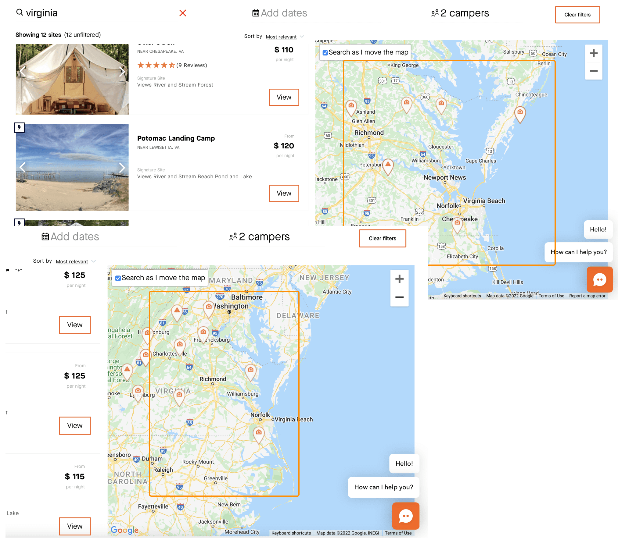
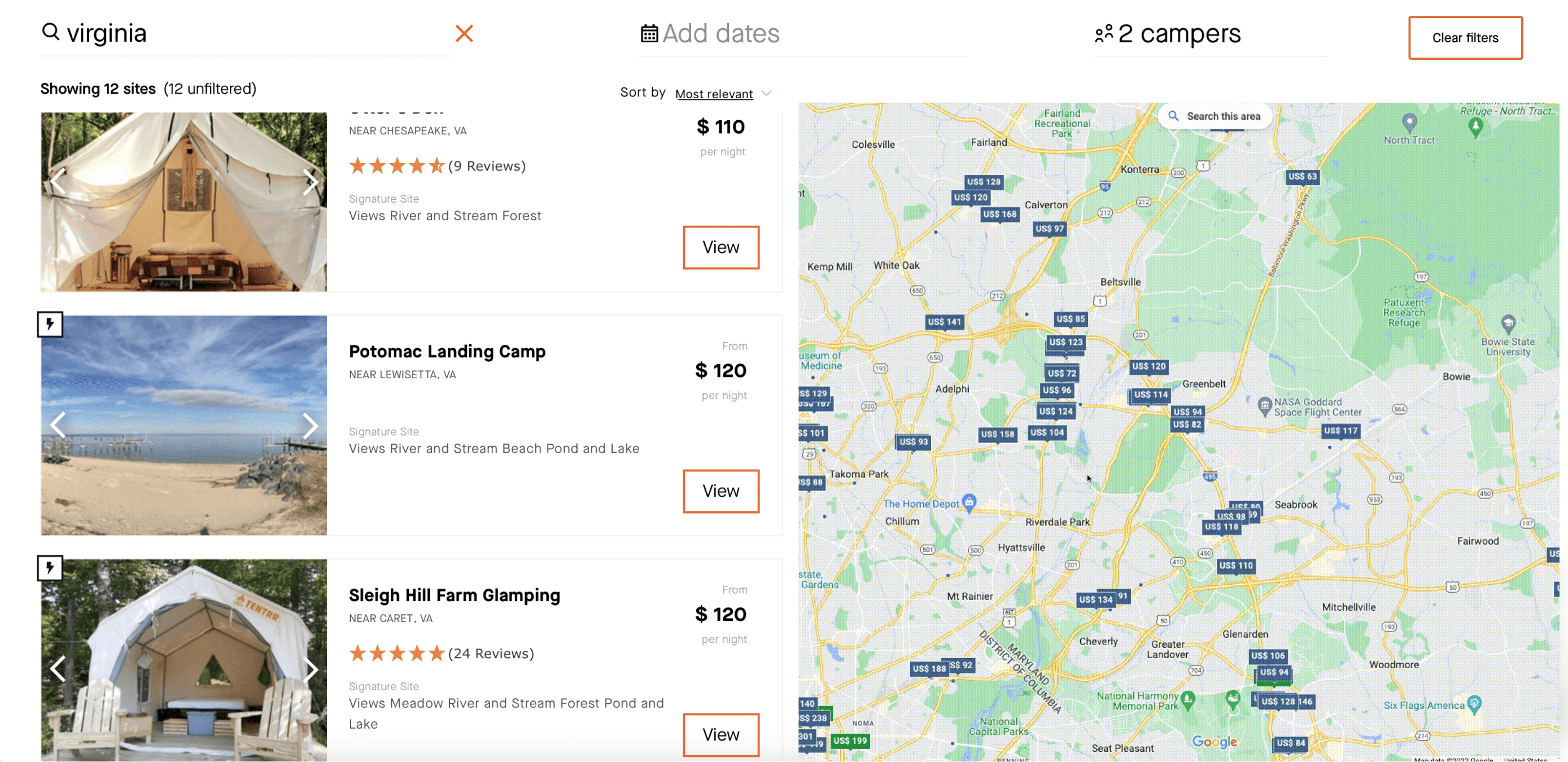
All participants failed to use the map feature to locate the campsite closest to the sea. (Although one participant performed the task as intended) The map shows different campsites at different zoom levels. Users might not end up with the desired campsite by using the map.
Recommendation
A google maps like behaviour in which the pinpoints on the map stay consistent when zooming in/out.
## Filter Function
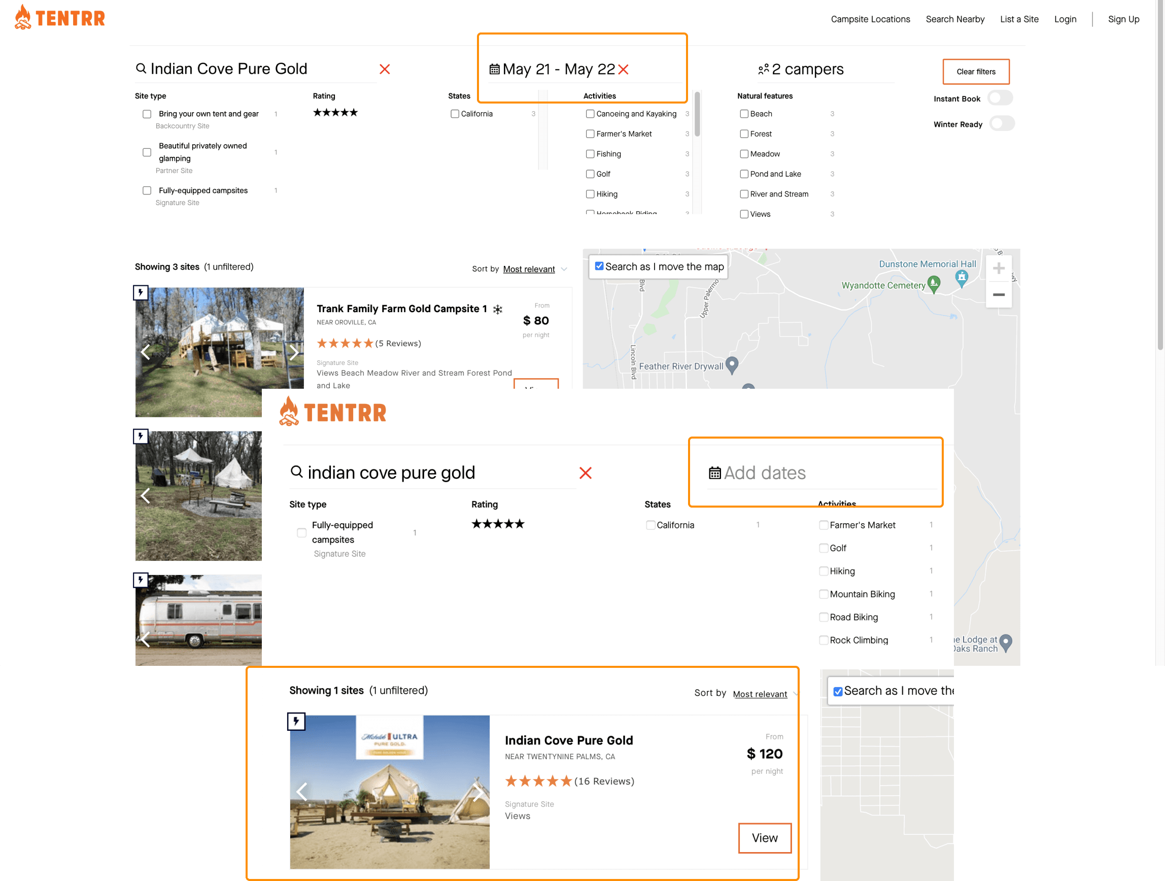
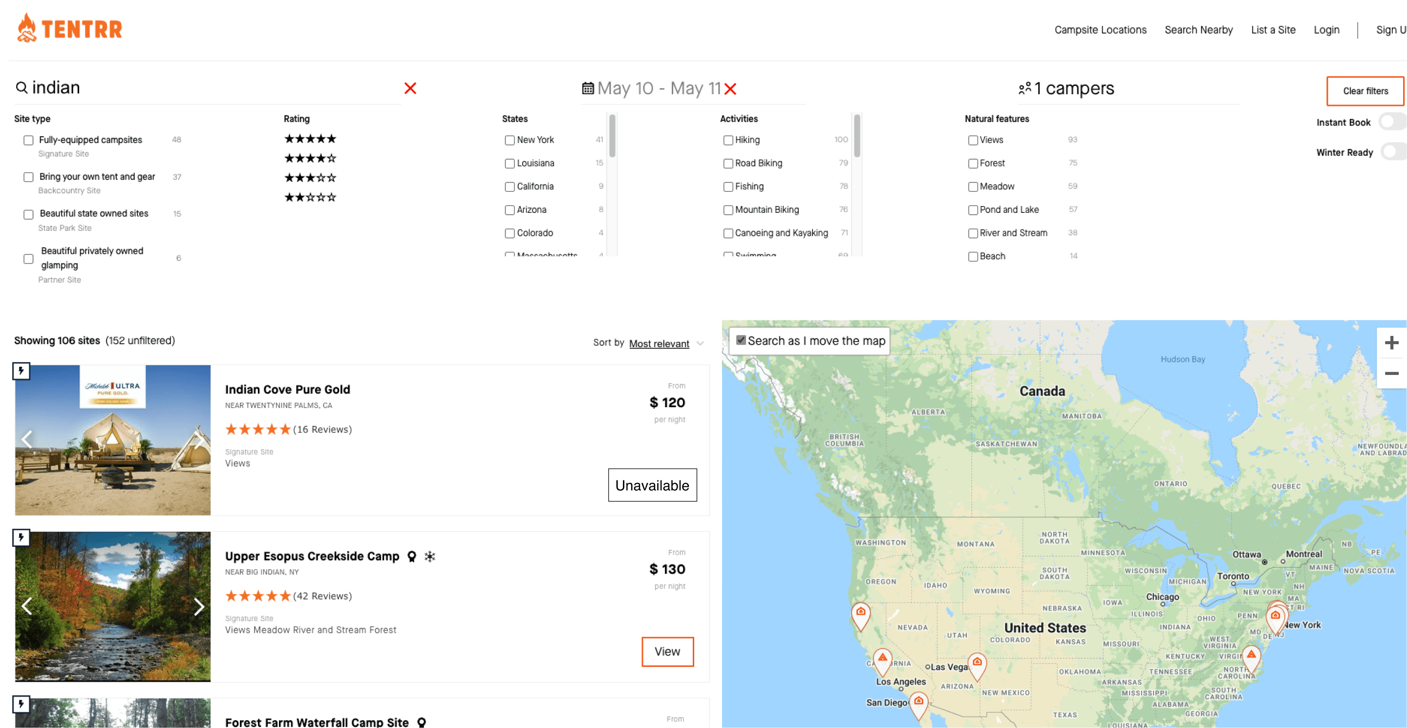
All participants failed to find a specific campsite by searching the campsite’s name. They all assumed they did an incorrect search. They did not realize the campsite is unavailable during the selected dates, because the website does not display any unavailable campsites in the search results.
Recommendation
Graying out the unavailable options and not omitting them from the results would convey the right message to the users.
## Homepage Search Function
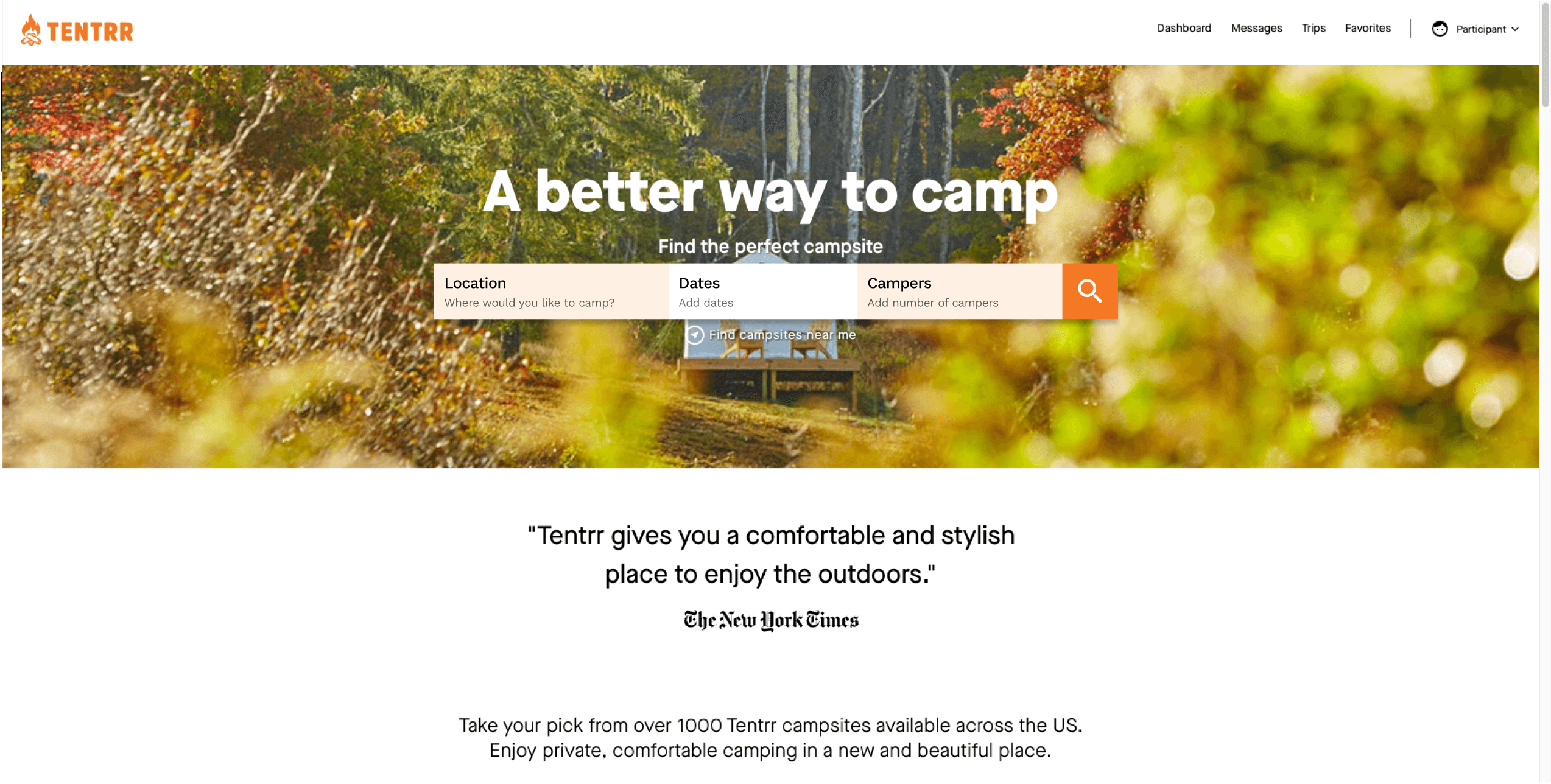
Another factor leading to the misunderstanding is the lack of selections for dates and the number of campers on the homepage search. Some participants assumed that the filters would reset with a new search from the homepage.
Recommendation
Adding the basic filters on the homepage would indicate the users on what the status of those filters are when they revisit the page and also helps search for campsites better even before going to the results page.
# Takeaway
## Importance of research approaches
Adopting different research approaches in a research project would help to identify and verify the same usability issues, which would help you understand the real situation and provide you with enough understanding from users' perspectives.
## Interacting with the participants
While doing the usability testing, it is important to be in the participants' shoes. Be sure to include the message to let participants know they are not being evaluated but the product. By doing this, we would have friendly participants willing to share everything with us.
On the side, I always think about how the product design influences users' behaviors and the design mindsets/strategies behind it, which always surprises me. I enjoy talking to random people and learning something new from them, either their life experiences or tips for finding a parking space in an overly crowded city.